Visually Directing the Player
Posted on May 31st, 2011
by
Alex Rickett
(This article was originally written for www.HardyDev.com in November 2009 and has been edited for this version. The game in the article, Boryokudan Rue, has since been renamed to Gemini Rue, Visit www.geminirue.com.)

There are few things more enlightening about what is really wrong with a game than play-testing, and if you’re lucky, physical play-testing with a real, breathing person. The creator of a game always views things in a certain lens that skews the true perception of what’s going on, what’s needed, and what’s really visible to the player. For instance, in some of the play-tests I’ve had, I would run into a recurrent problem about the player’s visual direction–I want the player to go a certain way, open a certain door, or go down a certain ramp–but what’s the obvious direction for me is not the obvious direction for the player.
This doesn’t mean that the player is mentally impaired or “bad at video games.” On the contrary, one philosophy that I try to abide by in game-design is that there are no bad players–only bad designers. If a player feels stupid, cheated, or frustrated, it shouldn’t be the player’s fault. It should be the designer’s responsibility to prevent the player from feeling this way, and in order to do this, there exists the much beloved activity of play-testing.
There are many problems that arise out of a good play-test, but I’m going to focus on the aforementioned one of “visual direction,” to guide the player a specific way.
First, what is “visual direction?” I would define it as using visual elements on screen to give the player a specific direction to reinforce her gameplay goals. For example, a giant arrow pointing down a hallway telling the player to go this way, not that way.
Why do we need visual direction in games? Sure, there’s some fun in being thrown into a non-linear situation with no direction or hint as to which way to proceed, but oftentimes the player needs a reinforcement of her goals, a reminder of what she should be doing. If I’m presented with a choice of three random doors, one of which continues on the correct path, the other two on the wrong path to my doom, I don’t want to recurrently guess which way to go and end up spending half my time going the wrong way only to turn around and try to find the correct path again. By using visual direction (a cue hinting the player which way to go) to restrict non-linearity, you decrease the amount of time that a player is lost and confused, and increase the amount of time that the player is pursuing her goals, arguably creating a more enjoyable experience for her.
Why use visual direction instead of directly telling the player what to do? So you may ask, why not just out-right state to the player, “Go to this screen. Open this door. Exit this hallway”? The answer is because you want the player to feel like she has solved something, that she was the one who discovered the solution, not was told it. It’s the same principle in any Zelda game when you realize that the little eye on the monster’s back is glowing and that is the key to defeating him. You weren’t told directly that this was the solution, but you inferred it by the game’s visual direction.
In some scenes in Boryokudan Rue (minor spoilers below), my current project, I wanted the player to do many things: interact with a cord on the ground, exit a screen to the right, go down a ramp to an adjacent room, etc. But many times the player would totally miss these items on the screen and be lost for several minutes before even realizing those elements existed. To solve these problems, I proposed the following solutions:
1) Lighting Cues
The first visual feature I adapted to help guide the player is lighting. Negatively, nothing is more visually confusing than a monotonous wash of colors that blend into each other. With this, the player cannot tell what is going on, what is where, or what he has to do. One easy way to combat this and direct the player’s eyes to a certain spot is by using lighting cues to contrast with the rest of the background.

In this screen, which occurs during the latter half of the game, I had several goals. First, I wanted to develop the player’s sense of a journey by making visible the city in the distance, a location that he had visited earlier. This is to provide him with a visual reward for all the progress he had made. Second, I wished to present the player’s next location, an abandoned “warehouse” (spoiler alert!), seen on the right. However, as the scene exists above, it could still be improved by directing the player more efficiently.
Originally the only light source was the lamp on the left, which highlighted the player’s entrance. However, the direction as to where to go from here is slightly ambiguous because the rest of the background is somewhat monotonous in color and value, although there is only one visible exit. To accentuate the player’s direction, I added a spotlight over the door.

This contrasted the right side of the environment with its dark surroundings, directing the player to go to the door rather than anywhere else. Through lighting, the game prevents the player from wandering around unnecessarily and gets him back to their goals more efficiently.
2) Hotspots
The second feature, although being text, is a hotspot indicator. This involves directly stating to the player that yes, this is an element of the background you will need to interact with, and yes it is there. Many games use this feature to indicate exits on a screen with an arrow of some sorts, but in my case I just used a label.

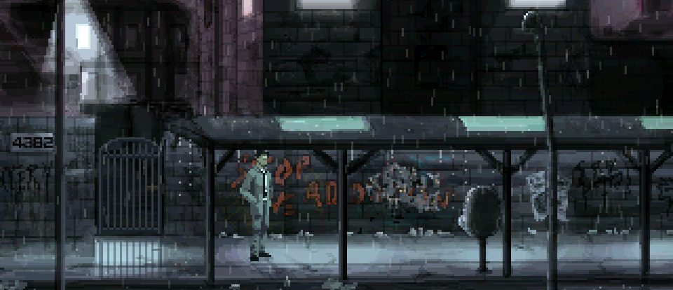
This environment, which is explored during the introduction of the game, is meant to illustrate the city life of New Pittsburg. The windows suggest the city’s inhabitants who are cooped up inside, the presence of the vendor gives life to the scene, and the moody lighting indicates further action beyond the immediate side-street. I made the major sources of light indicative of the key gameplay elements in the background: the shopkeeper’s hut, the red door, and the back alley (I also have the windows lighted up, which in retrospect, I’m not sure is a good idea since it attracts attention away from everything else). However, this area had the problem of unidentifiable exits, one of which was harder to spot than the others.
Some players did not realize that you could walk behind the shopkeeper into an alley in order to gain access to an additional area. Since I already added a secondary red light source coming from the alley (which failed to attract enough attention), I created an additional hotspot label, “Back Alley” on top of it to tell the players that they could go down this way. This directly communicates to the player that the alley was a feature of the game by giving her feedback every time she moved the mouse over the alley. Thus, this use of a hotspot helped solved the problem of the player missing the exit.
3) Animation
Sometimes using both lighting and hotspots isn’t enough for a player to figure out that he needs to interact with something. In this case, a third useful element is animation. This could involve flickering a light on or off, rain dripping out of a leak, or dust particles floating in the air. Motion draws attention to itself and subsequently the objects contained in or near the motion.
The following screen is in a dark and moody room, which I utilized to create fewer, more important swabs of light. These important swabs of light would direct the player’s attention to the parts of the screen that mattered. In this spot I wanted players to pick up a cord on the ground in order to solve a puzzle. However, even with the additional lighting the cord would still be missed by players.

What I then did was create a particle animation that recycled in the light, drawing further attention to that area. This was just a simple animation of dust pixels falling, but it stood out from the rest of the screen because of its dynamic nature in contrast to the static background, drawing the player’s attention to it. This animation was just one more step to help the player concentrate on the puzzle, rather than spending his time looking for it instead.
4) Contextual Trails
The last item to guide the player visually is something I will call, for sake of convenience, “contextual trails.” This last image illustrates a small ramp that players needed to access to continue, but due to its somewhat tangential location on the screen, players would continually miss it. I tried lighting, hotspots, and all that good stuff, but I eventually realized there was a much simpler solution.

My solution: blood. When all else fails, blood can solve any problem. Add blood to a scene, lead it down a path, and the player will be helpless but to follow it. And it doesn’t have to be blood either–it can be footsteps, water, or anything that leaves a trail. Blood just happens to come with the added narrative weight of tension (you are in danger!), conflict (somebody killed him!), and history (there was a past here!), which inadvertently enhances the atmosphere. Visually indicating that someone else in the game has already walked this path is probably the most surefire way to move the player without directly telling her to do so.
—
Visual indicators are a great way of leading the player to her goals without being overbearing. Without this, players may feel lost or spend unnecessary time wandering around rather than actually playing the game. Visual direction is meant to maximize the time that players spend involved in the gameplay, rather than looking for the gameplay itself.
However, there are many other things you can do visually that also communicate to the player, but in a different way. You can shake the screen to increase tension, telling the player to hurry up on her merry way; you can flash the screen red to indicate that she is pressed for time; you can animate lights failing to indicate the worn-down condition of the environment—so much can be done visually in games to communicate to the player and enhance the atmosphere that cannot be done with text.
Games are all about providing absorbing experiences, and visual direction is just one way to enhance that. I’m sure there are many more ideas that are out there and I’d love to hear and discuss them. It’s important to utilize every aspect, visual or otherwise, to continually communicate with the player in order to provide a better gaming experience.
