Walk Cycles
Posted on April 19th, 2011
by
Alex Rickett
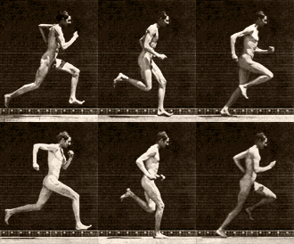
When drawing your first walking animation, it’s easy to be intimidated by the frequent use of Eadweard Muybridge’s photo montages in many animation books.
Getting a believable looking walking animation for a game character is pretty simple though, especially at low resolution. Mario’s walk cycle from the original Super Mario Bros., for example, was only 3 frames.
It’s actually missing a lot of what we think of as key points. The right leg never makes contact with the ground, and the left leg never extends forward. If a walk cycle covers one leg’s complete cycle from extension to contact to trailing to raising we really only have the first half of an animation here, but it works in the context of the game. Everything in SMB is choppy and goofy, and the action is too quick for the player to really notice… and come on, they didn’t have the memory to store a million frames anyway. You do.
So here’s one way to do a super smooth walk cycle called “Budget Rotoscoping”:
Find an existing sprite out there in the world from your favorite game. I forget what game this is from but it’s a pretty cool gladiator animation.
8 frames looped, a decent length if your game is super small format or low framerate; but if it appears as big as I’ve blown it up here, running in a 60fps game it looks pretty choppy.
THIS IS AN OK LOOK FOR ROBOTS (but not people)
The first thing to do is abstract away all the detail and make it easier for us to work on the motion of the sprite quickly. Make the guy entirely one color, then smash him down to 25-50%.
(I’ve blown all the sprites up to the original size for the purposes on analysis but you should work on them at their smaller scale)
![]()
Here it is in motion:
Now to smooth out the animation. First we’ll double the frame count so there’s two of each frame. What was originally frame 1,2,3,4,5,6,7,8 is now 1,1,2,2,3,3,4,4,5,5,6,6,7,7,8,8; so 16 frames total. To smooth out the animation just edit every duplicate frame so that it transitions between its neighboring frames. It’s pretty simple work and doesn’t have to be super precise yet, as long as every limb changes a little bit per frame it’ll probably look ok.
and in motion–
My gif exporter wont let me change the framerate but the above animation should be running twice as fast.
Now we have to think about how the sprite is going to be used in a game. Since the character will be moving at a constant rate (or at least have the animation speed change based on horizontal speed) we need to make sure the feet wont slide across the ground unrealistically. You can see in the animation below that we still have some problems in this area.

The animation speed vs ground speed is matched pretty well but there are some frames that hold the foot position on the ground too long. This is called “slippage”– when the character looks like he’s rollerskating. I went back into the animation and shifted the entire position of the figure in the frame during these moments of slippage. Some surrounding frames had to be adjusted because of this. It’s looking pretty smooth now.
Now we can work on the look of it. Separate all the limbs by coloring them differently, then smooth out shapes and add details. I gave the guy boots first, then gloves, and finally a hat. I also made him rotate his head and body a little more naturally with his stride. Partially this was a function of working from a silhouette which forced me to imagine the placement of each limb for each frame. I ended up changing a lot of different pieces along the way. If you make a practice of constantly flipping between frames you’ll get a feel for what needs adjusting.
and in (slow) motion:


